

When people think about a LinkedIn headshot, they often start by asking about the background.
Should it be white? An office? A city skyline? Something modern?
I believe that’s the wrong place to begin.
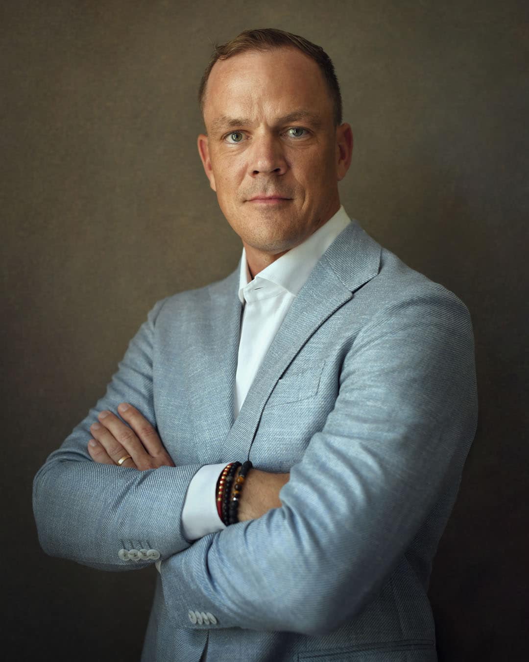
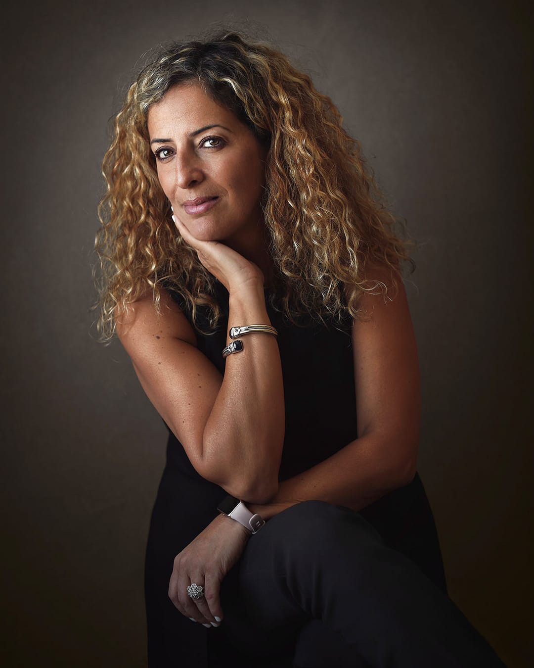
The strongest LinkedIn portraits don’t make you notice the background first. They make you notice the person. Everything else should quietly support that.
Every decision in a portrait should guide the viewer’s attention towards your face. Expression, eye contact, lighting and composition work together to create an immediate impression. If the background is competing for attention, it’s working against the portrait instead of supporting it.
That’s why I deliberately keep my backgrounds understated. They’re designed to recede naturally, allowing your expression to become the strongest visual element.
People often assume a white background looks more professional simply because it’s common. I’ve experimented with many different styles over the years before developing the approach I use today.
A bright white background can make a portrait feel flatter, reducing the sense of depth that gives an image presence. Instead, I prefer darker backgrounds inspired by fine art portraiture, where the subject naturally separates from the background.
The objective isn’t to create drama. It’s to create depth.
My work is influenced by classical portrait painters such as Rembrandt, particularly in the way light and background work together to draw attention towards the subject.
The background isn’t completely flat. It contains a very subtle texture, just enough to make the portrait feel richer and more natural without ever becoming distracting.
Most people won’t consciously notice it. They’ll simply feel that the portrait has greater depth and character.
Many business portraits include offices, meeting rooms, bookshelves or city skylines behind the subject. There’s nothing inherently wrong with that style.
For my work, however, those elements often become unnecessary distractions. Every object, line and colour asks for a little attention. Collectively, they compete with the one thing that really matters: the person.
I prefer removing that visual noise altogether so the viewer instinctively connects with the face rather than the surroundings.
One of the biggest misconceptions is that a darker background automatically makes someone appear intimidating.
I don’t believe that’s true.
Warmth doesn’t come from the background. It comes from expression, eye contact and the way someone is photographed. A genuine smile, kind eyes and soft directional light create approachability regardless of whether the background is light or dark.
A timeless portrait isn’t timeless because it looks old-fashioned. It’s timeless because it isn’t chasing fashion.
Backgrounds that feel contemporary today can quickly date a portrait in just a few years. A quieter background doesn’t try to impress. Instead, it quietly supports the subject, creating separation from the face and allowing the person to remain the focal point of the composition.
If I had to prioritise the elements of a portrait, expression and eye contact would always come first because they reveal the person behind the photograph.
Lighting comes next because it gives the face shape, depth and dimension. The background supports that lighting, helping the subject stand apart from it rather than blending into it.
Finally, clothing should reinforce professionalism without becoming the centre of attention. Well-fitted garments, solid colours and careful preparation help create a portrait that feels refined without looking overstyled.
Some people say they don’t care about the background as long as people can clearly see their face. That’s a perfectly valid point of view.
The only thing I’d add is that people don’t experience portraits one element at a time. They don’t consciously separate the expression, the lighting and the background before forming an opinion. They absorb the entire image in a fraction of a second.
That’s why every element of a portrait should quietly work together to tell the same story. When nothing competes for attention, the person naturally becomes the focus and that’s what creates a portrait people remember.
If you’d like to see how this approach translates into finished portraits, you can explore examples of my work and learn more about the experience below.